


Note the sky texture. Right now we're just sketching out the rough outlines of the courtard we're building. We'll be polishing it up after we lay it out. The sky, for instance, will be elevated alot more. However, now that we're on the same sheet of music, let us continue.
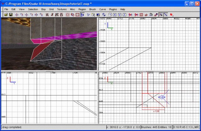
Now we're fleshing out the actual courtyard. All I'm doing is adding a rectangular section, which will be the courtyard proper. Having completed that, I'm then taking the widening corridor (pictured in the last screenshot), cloning it, flipping it, then positioning that portion on the other side. The courtyard is now symmetrical. For a screenshot, gaze with awe below.
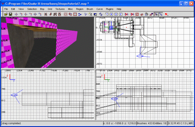
The rough courtyard is basically finished
You can feel free to cap the open side and take a look around. Seem a bit large? A bit barren? Indeed, it does to me as well. However, I have some future plans for this courtyard, so the 'largeness' will hopefully dissipate as we flesh out the area. Let's go ahead and make the courtyard seema bit less plain, shall we?
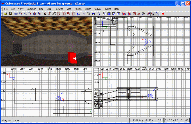
I'm beginning my lifting our sky up considerably. It just doesn't look right, squashing down like a ceiling. I'm moving it so that it's at the same level as our other sky, in the first deviation. With that done, I'm moving the walls to match up correctly. I've also mirrored our existing entranceway to this courtyard to the other side, for simplicity's sake.
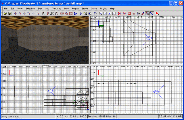
Extending the sky
However, the courtyard is still, very boring to look at. To continue remedying this situation, I'm going to drop the floor down just a tad. At a 32 grid settings (6 on the numpad) I've dropped the floor down one notch. Following that, I'm extending all the walls down on notch to close out the void. In the case of the entrances, I have a small, exposed portion of the floor caulk. This I'm texturing with base_trim/tin just for the hell of it. Finally, I'm retexuring the entire courtyard floor with organics/grass3. To keep the patterns from being quite so bad, I'm changing the vertical and horizontal stretch to 1, rather than .5. It doesn't eliminate the repititious nature of this texture, but it does control it a tad.
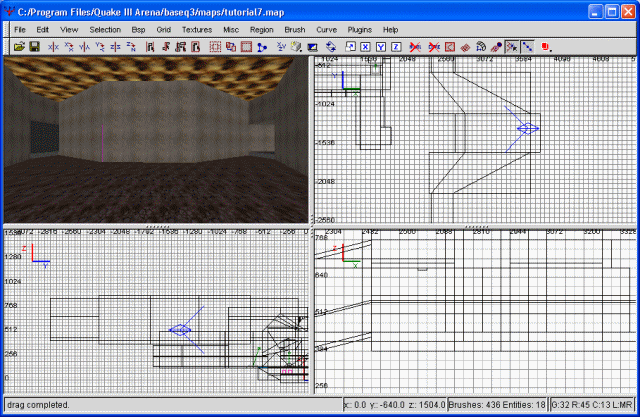
Fixing up the floor
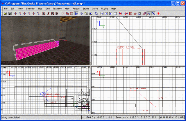
After compiling and checking out the map, I noticed our "step" out of the courtyard requires the player to jump. I'm not too keen on this, since it could stop a charging offensive player in mid gallop. What I've decided to do is add an insivible step to assist in walking up this area. To do this, I just resized my grid to 16 (numpad 5), drew out a step and textured it playerclip (or just clip). In case of confusion, that's common/clip. No more jumping required.
Next, to make the walls more interesting. First, we're going to highlight all the walls, then clip them horizontally at (roughly) the 496 grid mark. This is basically the same thing we do to put light in, but for once that's not my objective. Once this is completed, deselect everything. Select one of your walls (doesn't really matter which one first, but I suggest one that's not diagonal) and then clip it so the inside has a slope outwards. Allow me to demonstrate.
Slanting the walls
Now, go ahead and apply this to all your walls. The diagonal walls will be a bit tougher, since they're not in a simple, straight configuration. Still, good practice. :) Remember, once you finish one half of the courtyard, you could always copy, paste and flip the brush, instead of having to do the exact same to the other side. You may have noticed this opens quite a few holes into the void. Take care of these however you see fit. One of the best ways, for the truly odd-shaped holes, is to simply clip it so that it's not really odd-shaped anymore.
Next, I'm going to texture all of the sloped brushes with gothic_wall/streetbricks10_shiny. Eh, why not. It looks different. I've had to rotate some of the textures so they line up correctly, but this is definetely easier than the previous part. Now, highlight the remaining, vertical walls and clips these vertically along where the slope intersects them. I know that sounds a bit confusing, so allow me to demonstrate.
Clipping the vertical
Keep both halves. As a result of our creative clipping, it can be difficult to line the clips up right. However, they WILL line up. It's just a matter of finding out where. In case where we've elongated brushes after clipping them (as I did), they will still line up with the grid at the point prior to our resizing. Expend all effort to make these things line up correctly. The first signs of a shoddily-built map are 'sparklies' everywhere, or small peices of caulk showing. Avoid this at any cost. At any rate, once finished, we're texturing the underneath of our vertical walls with base_wall/xbasewall04. I went ahead and 'fit' the texture, but it doesn't especially matter.
Next we're going to do the same to the top of the wall as we did to the bottom. Obviously, this would be a lengthy endeavour if we did it by hand, so instead I'm going to use the copy/paste/flip method. To begin with, I'm selecting all our walls we just messed with and shrinking them down a bit. The height of this courtyard is fine, in my estimation...to double it in size would be a bit extreme. Once I've shrunk all the walls down, I'm selecting everything (all the walls and their 'baseboards', if you will), then copying and pasting them. Next I'm going to flip them around the Z axis. This turns them upside down. Following that, it's simply a matter of aligning them right, then filling in any holes to the void.
The top of the wall
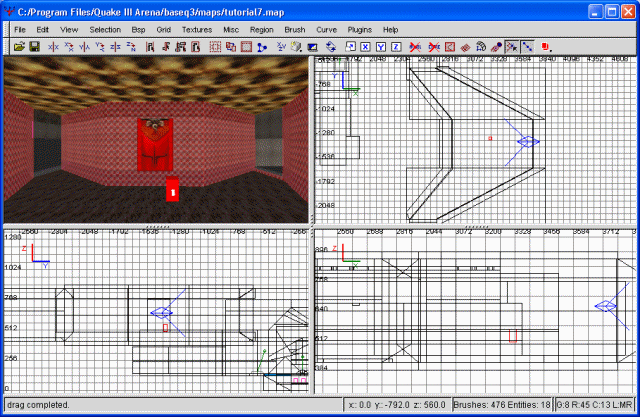
At this point we could continue to decorate this courtyard until it actually looked presentable. However, I'm just going to do a pair of simple things and then call it a day. Firstly, I'm going to change the textures at the top of the wall. I'm replacing the top wall texture (not the brick one) with a light texture instead, namely base_light/ceil1_22a. Since most people won't look up here, I'm not going to bother changing its sizes. Next for the brick texture. This I'm replacing with gothic_wall/oct20c. With that accomplished, I'm going to hang a flag from the middle wall. Since not much else is red in here (besides the lights), this'll be a good way to announce which base this is.
Lastly, we need to do one structural thing real quick. With the walls the way they are, the temptation for someone to squash themselves in there (especially on top) is far too great. As such, I'm going to put some player_clip brushes all the way around this room (except for the doorways, of course). This will prevent stupid camping and will also keep people from potentially getting stuck.
Finishing up the courtyard
You may be wondering what that red entity in the middle of the room is. That's my info/player_deathmatch entity, so when I compile the map I don't have to run all over the place to get to the courtyard. As my map expands in size, I'll be moving it around as we shift from place to place.. For those that care. :)
Excellent, the courtyard is basically done. There are some excess brushes floating around in the background (an earlier step had us clip these off), and if you check out the screenies you'll notice there's alot of brush area that's unnecessary. This isn't going to mess with your map's playability. In fact, some opinions seem to be that having that much "insulation" from the void is good for your map's framerate. However, they WILL slow down your map compile. Your choice if you want to delete them or not...I think I'm going to keep mine for the time being.
And with that, we're finished. We've managed to complete the main and balcony entrances, thereby fleshing out our map considerably. In fact, all we really have left to do is midfield, the water way, and then polishing everything up. As usual, the map file is available for your perusal below.
Tutorial 7 map file