


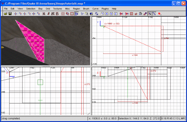
Keeping the curve selected, choose curve, then cap selection. This will bring up several possible options. By looking at the appropriate pictures, though, I'm sure you've (correctly) come to the conclusion we need the 'inverted endcap'. Once you've selected this, the rest of the area is automatically filled in. Congratulations, we have our first arch.
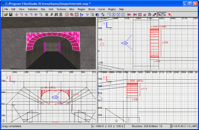
The archway
Now all we need to do is wrap up the loose ends. We'll begin by texturing our newly formed arch. Select the portion we just created (the inverted endcap) as a whole brush. This isn't actually a 'brush', per se. It only really has one side. As such, select the thing as if you were selecting an entire brush. Next, texture it. You should notice the textures are pretty messed up. Bring up the surface inspector, and under the 'patch' heading, hit the 'CAP' button. Now our textures should line up nicely. Do the same thing for the other side of our arch.
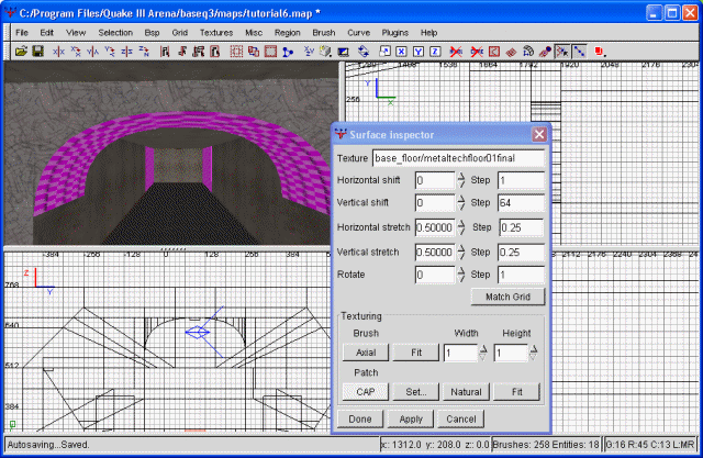
The textured cap
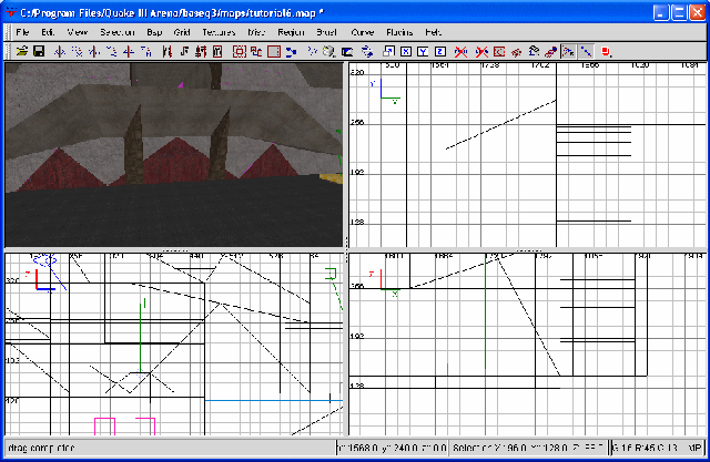
We'll be texturing the bottom of the arch in a similar fashion. Select the bottom as if you were selecting an entire brush, then choose your texture. I've decided on the gothic_ceiling/xstucco7top texture. It's a major depature from our usual, rather bland texture set. Once you've actually textured the arch, bring up the texture inspector and choose 'natural'. This will properly proportion the texture. Additionally, I also textured the regular wall directly below the arch with same texture. Finally, we need to do some minor clipping and texture everything now hidden by the arch as caulk.
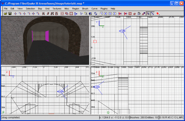
The finished arch
Let's move on. I have, yet again, changed my mind about something. You remember the freaky shader bug with the light strip on the ceiling? Well, I've decided I don't much like it after all, so I'm going to retexture it with base_light/light5_5k. Once more, I'll need to realign the light as much as possible. Once we've accomplished this, the light in the area has changed dramatically. Personally, I thought the ceiling was far too dark, and this definetely improved the situation. Let's continue.
Next we're going to focus on the balcony. It looks fine the way it is, but I think we could add a little more variety by giving it 'supports'. These will be small brushes ostensibly holding up the rest of the balcony. We'll begin, as always, with a single brush. I plan on making two such supports, but we'll begin with just one and then copy and paste it. Draw the brush.
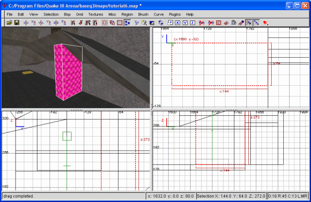
The first step to supports
Next we're going to clip it so it doesn't intersect the actual balcony. This should be pretty easy by now, so I won't go into how to do that. Following this, I'm going to clip it again so the whole support is angled inward until it intersects the wall. This, too, should be fairly straight forward. Finally, I'm going to clip it so the front is pointed. Here's a screenshot to show the results of all those steps.
The second step
Finally, let's texture it and then clean up the area by caulking everything the support is blocking. I've decided to texture the supports with gothic_ceiling/xstucco7top, just for the hell of it. Once you've textured it and caulked the hidden areas, go ahead and copy, paste, then flip the result around the y axis. You can then move this down as a second support and clip/caulk everything that IT hides.
Ok, with that done, we can do something about the wall itself. I'll begin underneath the balcony. I'm going to select all of our wall brushes. Then, once they're selected, I'm going to start clipping them diagonally. Once I've done that across the entire wall, I'm going to texture it with a combination of the original wall color (base_floor/metaltechfloor01final) and
base_wall/metalfloor_wall_10.
The wall is a bit more interesting
Following that, I'm going to sink our freshly textured brushes into the wall a bit. I'll do this by selecting them all and shrinking their width in by 16 grid units. As a result, I'll need to fill in some floor (to close off the void). Also, you'll have noticed some caulk is showing. Every brush that is showing caulk will need to be clipped and textured. I'm certain we've done this enough that you know what I mean.
I've chosen to texture the caulk with base_light/ceil1_22a, which should make for some interesting lighting effects underneath the balcony.
Speaking of lighting, I've decided to make another change as well. In my estimation, the ceiling lamps in the flag room are far too bright. With all the additional texture lights that we've been adding, the entire flag room is being drenched with light. This, in turn, is washing out some of the light effects we're attempting to create. Thus, I've decided to go ahead and just delete all the ceiling lamps. Luckily for me, I hadn't remembered to clip and caulk the areas behind these lights, so there's no additional work to do. Even if I had done that, though, it still wouldn't be much work to simply extend some ceiling brush to fill the resulting hole. So, just delete the lights. If you compile the map, you should notice that light and shadow is much more prevalent, thereby increasing visual quality. However, there's still more than enough light to see what's going on.
In the same vein, I'm going to alter our spotlights some. These are the spotlights we have shining on our banners. With all the light we're generating, the spotlight effect is completely wasted. So, I'm altering it. I'm increasing the light value from 600 to 900. The difference still isn't too pronounced, but it does cause our banners to virtually glow. Works for me.
Next on our list is the corner of our flagroom near the balcony. This is the 'northeast' corner, as seen from the top view (top right corner, if you will). To begin with, I'm just drawing a simple, (almost) square brush extending from floor to ceiling. Next, I'm clipping it (using the side view) so that it slopes upward. Then I'm clipping it from the front view in a similar manner. This will create a pyramid-type look. Next I'm texturing it with base_wall/basewallbobbin. I'll also be using the surface inspector to 'fit' the texture. This, also, helps to break up the boring 'squareness' of our room. Before moving on, be sure to clip and caulk anything hidden by our new construction.
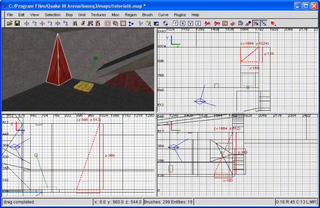
The corner
With that done, there are very few really plain areas left in our flag room. One of those is the 'south' wall. Let's go ahead and do something to it, shall we? From a previous step, the wall's already cut horizontally as if we were going to add a light strip. If you wanted to, you could delete the whole wall and redraw it as a single brush. This will cut down on compile times, but it doesn't affect the actual performance of the map. Personally I'm not too concerned with cutting down compile times. For the purposes of brevity, I'm going to clip a triangle shape into the wall. I'll use a screenshot to demonstrate.
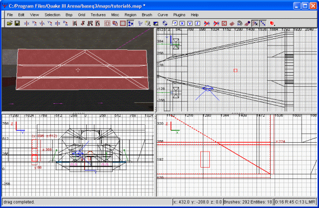
The south wall clipped
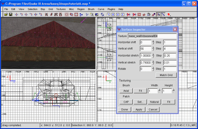
This triangle will serve as a base for our texturing. Everything outside the pyramid will stay as it is. Everything inside will be retextured. I'm beginning by texturing the whole thing as base_wall/metalfloor_wall_10. Why? Because I want to. Next, I'm texturing the bottom-most layer as base_wall/xbasewall04. I'm also using the surface inspector to change the horizontal streth to 1 and the vertical stretch to .79. Then I'm shifting it vertically to 56. This makes the resulting blocks larger and actually fit the size of the texture. An example, I think, is appropriate.
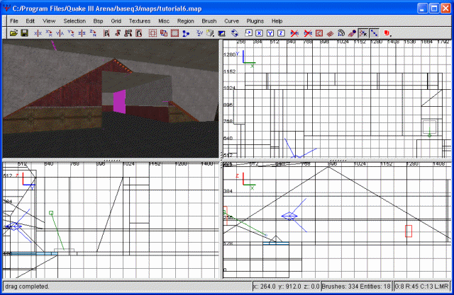
The south wall mostly textured
Next, the thin cut. This was cut for the purpose of light strips, but we don't really want any more of those. Any more light will only cause our flag room to get washed out again. Instead, I'm going to texture it with base_trim/border11_250. I'm changing the horizontal stretch to .1, and the vertical stretch to .125 so that the texture fits our stip. The rest I'm leaving as is.
Finally, let's take the whole bunch and recess it back into our wall a bit. I wasn't sure if I wanted to do that with this bunch, but I've decided it would look alot better. Once recessed, we'll clip the surrounding wall to the same depth. Now it's only a matter of filling in the floor and texture the lip around this recessed area. This should be straight forward enough that you can handle it. Remember, if you see pink, there's caulk showing. Texture it all. I've decided to texture the lip with base_light/ceil1_22a. This was stretched vertically to 1.01 so that I would only get one line of lights.
Alright, the south wall has now become a great deal more interesting. Of course, you could do anything you wanted to with this wall, or nothing at all. It's entirely up to you. The north walls are rather plain as well, in fact, so you could easily use the same method to make them more appetizing to the visual palate. For simplicity's sake, I've decided to basically mirror what we did on the south wall. Rather than go through all that again, I'm just going to supply a screenshot of the finished product.
The finished north wall
With that alteration, I believe our flag room is now adequately detailed. No longer are we staring at bland, rectangular walls with a washed-out, uniform gray. Everything is red, sure enough, but that's to be expected, as this is the RED flag room. The blue flag room will be almost uniformly blue, when we get that far.
At this point, feel free to run around your newly-built flagroom and make any additional modifications you would like. Personally I juggled around the idea of doing some more with the ceiling, but decided against it. However, this is all entirely up to the mapper, of course. With that, I'll bid thee adieu until the next tutorial. Grab the .map file for this tutorial below.
The map file for tutorial six.